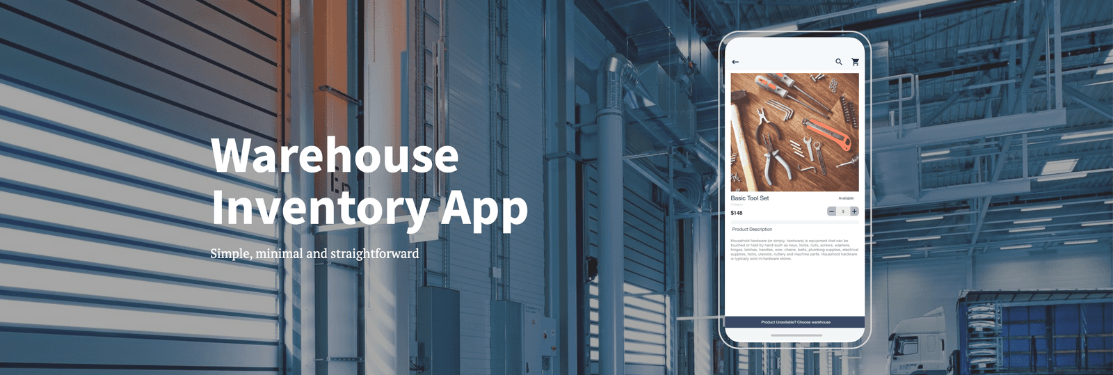
Warehouse Inventory App
Role
Lead UI/UX
Platform
Overview
A B2B mobile ordering platform designed for on-field technicians and specialists who need to source raw materials and supplies from a warehouse to complete their daily tasks.
Users identify what they need, place an order, and collect the fulfilled package from their nearest warehouse location.
The core design challenge wasn't building "another e-commerce app" — it was recognizing that a technician placing multiple orders a day, often in the field and under time pressure, has fundamentally different needs than a typical retail shopper. The product had to prioritize speed and clarity over browsing and discovery.
I owned the design end-to-end — from initial discovery and research through UI design and front-end implementation — working directly with stakeholders, a lead UX specialist, product owners, and the engineering team.
The Problem
The brief was straightforward on paper: let technicians select items and place orders, notify them when the order is ready, and let them collect it from a specified location. In practice, this only works if the interaction cost is near-zero.
The real design problem was: how do you strip a retail-shaped e-commerce flow down to something a technician can operate quickly, repeatedly, and without friction, often outdoors and under time constraints?
That meant getting three things right:
- A near-instant path from "I know what I need" to "it's ordered"
- Minimal navigation depth to reach any given item
- A visual system usable in bright outdoor daylight on a mobile screen
Research & Strategy
I approached discovery without assuming the solution was "make it look like a shopping app." Stakeholder interviews and direct conversations with technicians surfaced a consistent signal: users wanted the smallest possible learning curve, not more features.
Key research inputs:
- Stakeholder and user interviews to establish goals and expectations up front.
- Three user personas, built from interview themes, used as a running reference throughout the design process to keep decisions grounded in real user needs rather than internal assumptions.
- A structured survey covering three phases of the experience — access (login/signup), task navigation, and post-use satisfaction/likelihood to return.
- A competitive review to identify functional gaps and a clear point of differentiation, rather than defaulting to feature parity.
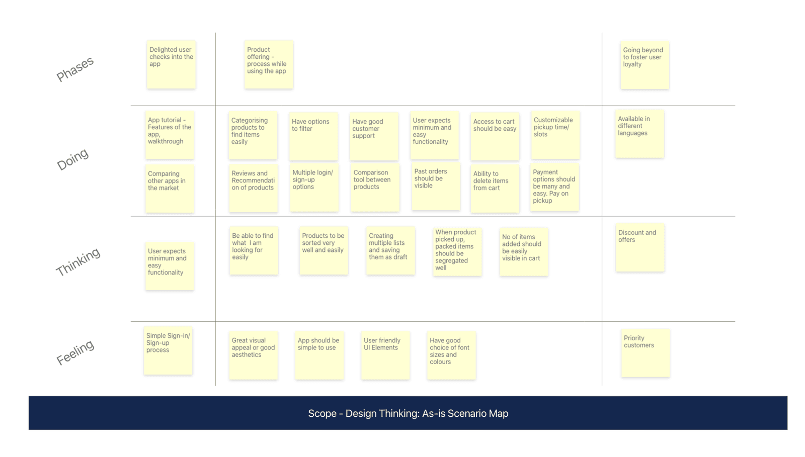
As-Is Scenario Map outlining current pain points
These inputs converged on the same conclusion the interviews suggested: reduce friction everywhere, and don't make users work to find what they already know they need.
Structuring the Experience
Mapping the user journey clarified the priorities that shaped every subsequent decision:
Navigation depth was the enemy
Technicians needed to move between key screens with minimal taps, not explore a catalog.
Search as a primary action
Most users arrived already knowing what they needed — the product's job was to get out of the way, not encourage browsing.
Tight categorization
Inventory and categorization needed to be tight and predictable. Poor categorization directly translates to lost time in the field.
Persistent draft/cart
A key differentiator — letting users build and revisit an order list rather than completing everything in a single pass.
This journey map was reviewed and iterated with stakeholders, product owners, and the lead UX specialist before moving into wireframes.
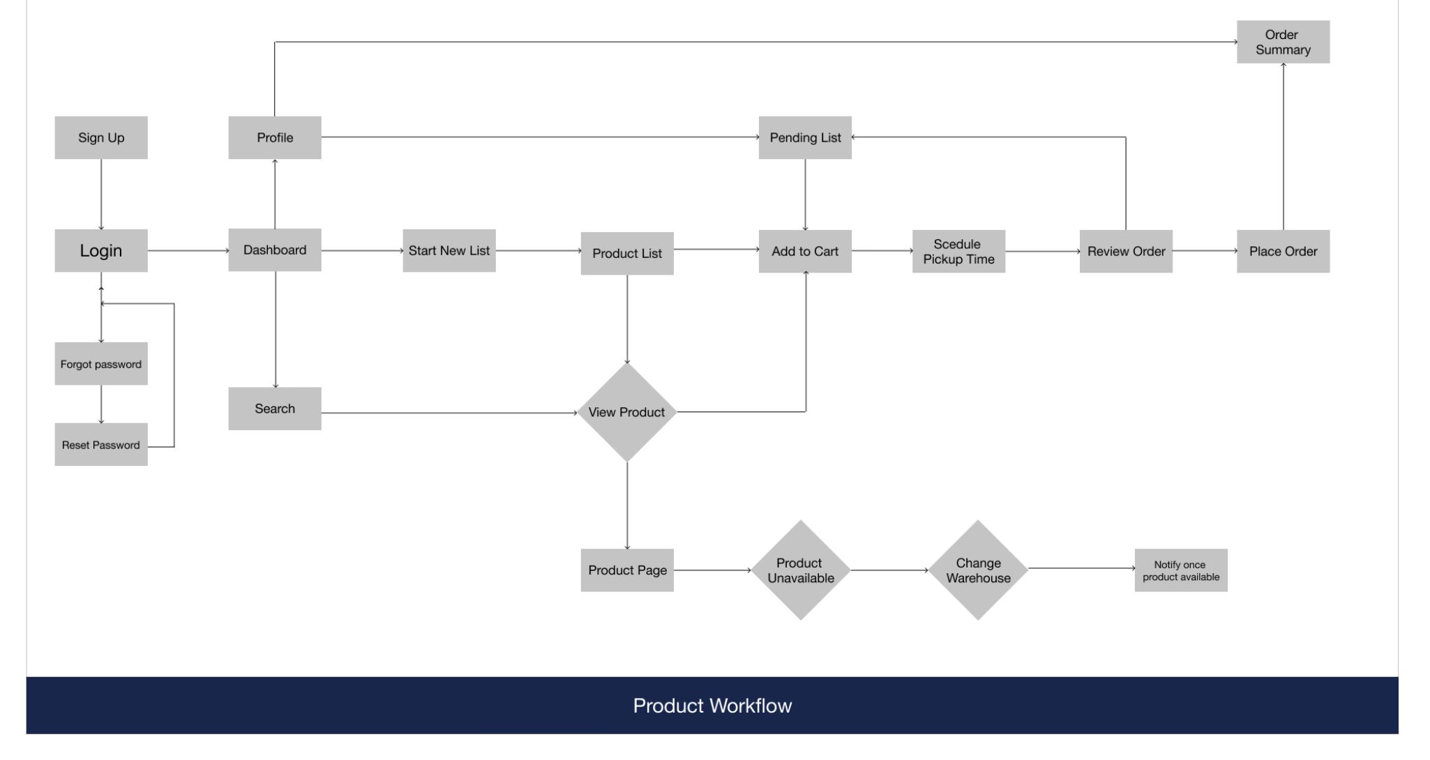
Product Workflow & Architecture
From Wireframes to UI
Early low-fidelity wireframes (built in Adobe XD) tested a few structural bets directly:
- Moving primary actions out of a hamburger menu and into a bottom navigation bar, cutting a full navigation layer off the most frequent tasks.
- Enabling add-to-cart directly from list views, removing the need to open a product detail page for users who already knew what they wanted.
- Refining information architecture based on direct feedback rather than assumption.
These weren't cosmetic choices — each one directly served the "reduce friction" thesis that came out of research.
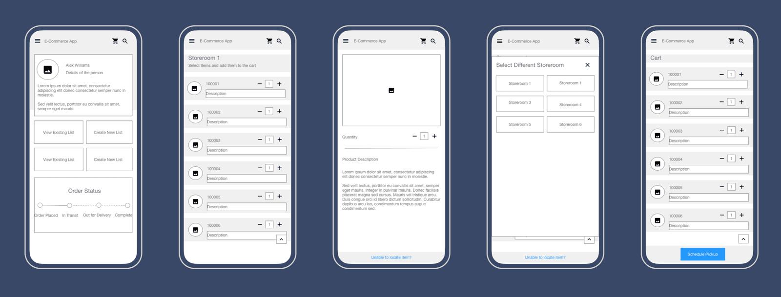
Early low-fidelity wireframes exploring structural bets
Mobile UI Execution
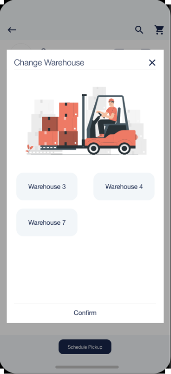

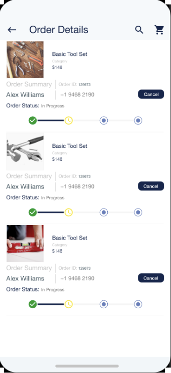
UI design (Figma) carried that thesis into visual execution:
- A light, high-contrast theme chosen specifically for outdoor daylight legibility, since the primary use context is technicians working in the field during the day.
- A restrained, non-distracting color palette — deliberately avoiding visual noise that would slow down task-focused users.
- Iconography aligned to Material Design and iOS guidelines for immediate familiarity.
- A clean, minimal visual language that prioritized clarity over decoration.
Front-end implementation (Bootstrap 4, HTML/CSS/SASS) followed the same principles applied to code: componentized SASS for reusable, modular styling; Bootstrap's grid system to handle responsive mobile viewports efficiently; and subtle micro-interactions added only where they reinforced usability rather than adding distraction.
Validation
Design and implementation went through iterative testing cycles with product owners and stakeholders at three checkpoints: post-wireframe, post-UI design, and post-front-end build.
Feedback was collected via shareable mobile links so issues could be caught and addressed early rather than compounding downstream. A final review after backend integration caught and resolved remaining accessibility issues before launch.
Outcome & Reflection
The result was a focused, field-ready ordering experience built around speed and predictability rather than conventional e-commerce patterns — validated through direct technician feedback rather than assumption.
The biggest lesson from this project was that differentiation only matters once the fundamentals are solid: for a utility-driven B2B tool, removing friction was a far higher-leverage design decision than adding polish. That principle — prioritize task velocity for the specific user context over generic best practices — has carried directly into later, higher-stakes commerce work.
"Gautam has worked to build solutions to deliver quality UX designs." — Project stakeholder